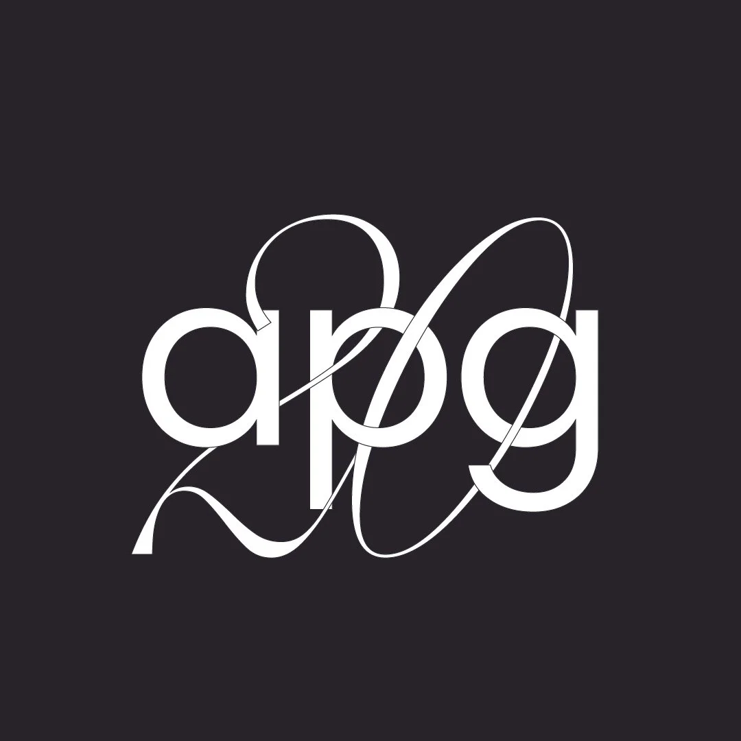
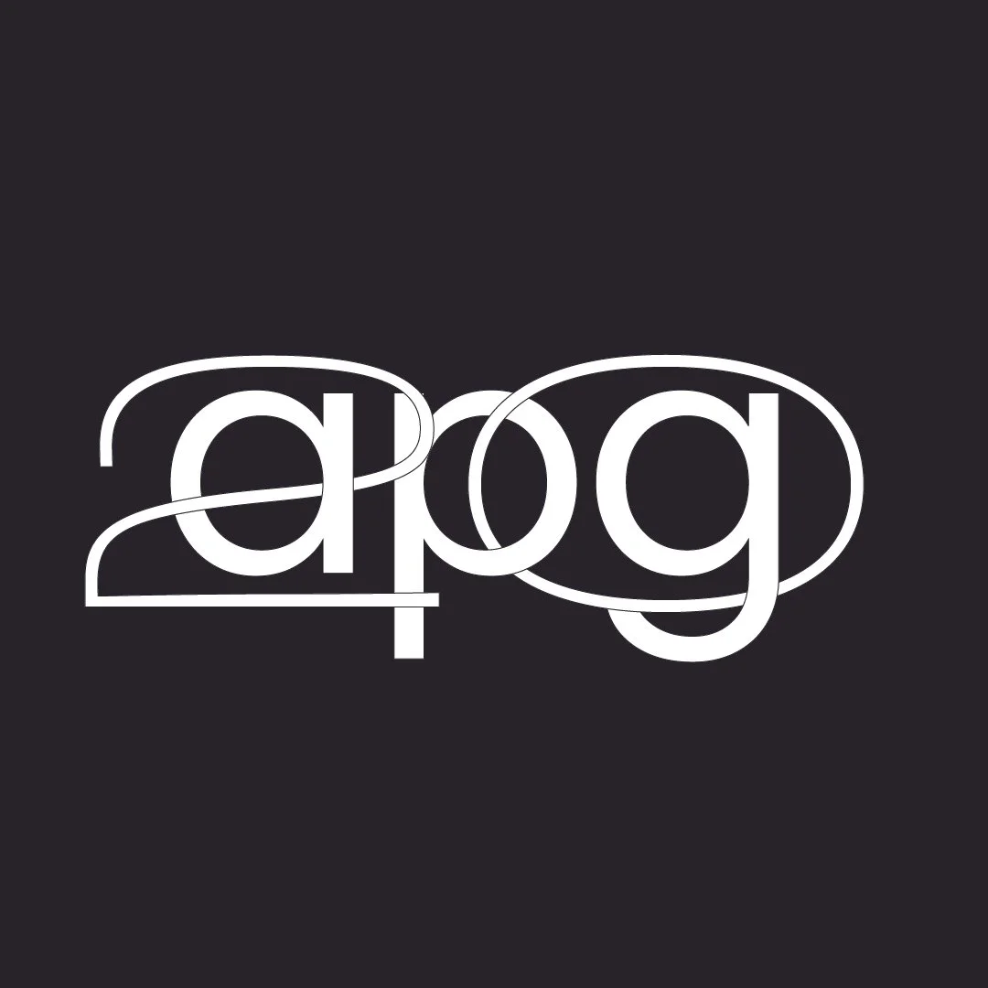
APG
Artist Publishing Group
I was asked by APG to create a suite of designs to celebrate their twentieth anniversary. APG’s logo is constructed with solid and stark type – so, my approach was to create contrast with the addition to the word mark. These are some of my favorite iterations. I’ve also included a PDF of the concept pitch document below.